Like many families living in suburban, new-ish, generic-ish builds in Texas, we have a giant wall in our living room.
It’s not that wide, but it is very tall because our living room is open to the loft above, which can be challenging to fill in a way that feels cozy but not busy, meaningful but not breakable (and especially on a budget).
I spent forever on Pinterest, as one does, and found that I was really attracted to the idea of a gallery wall. I liked it because it didn’t make me commit to any one piece of art (I have art commitment issues), and, because I could use family photos and other things I already had to fill the frames, which would save us money too.
I was also drawn to the idea of filling the whole wall. There is so much open space in our living room (lots of windows on two sides and open to the kitchen) that I knew filling in just a little bit of that giant space would go a long way in making the room feel a lot homier and cozier.
But there are A LOT of gallery walls on Pinterest. Like, a lot. And as I combed through all of the results I realized that I was drawn to the ones that were more minimalistic. They could be big, still, but they needed to be simple and clean for me to love.
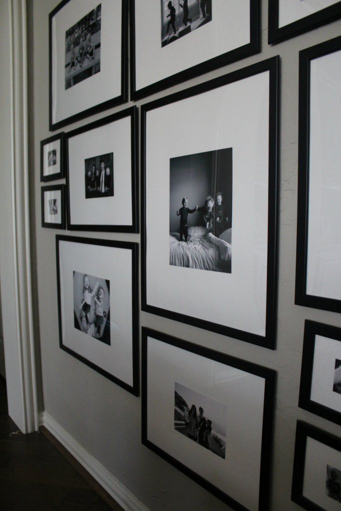
I finally landed on this one as my final inspiration:
Here’s what I liked about it and what I decided to go for with my own:
- Black and white. Since I was looking at filling such a big wall, I didn’t want the color to be too much. We have a somewhat busy, colorful rug in that room as you can see in the photos below, and I wanted the overall effect to be more calming than colorful.
- Big mats. I liked the custom look of the oversized mat, not to mention that it contributed a lot to making the overall wall look less like a homemade collage and more like a designer gallery.
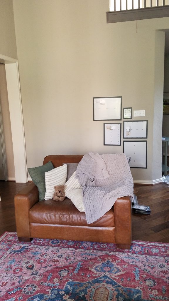
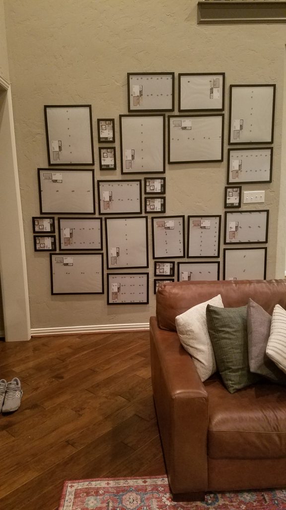
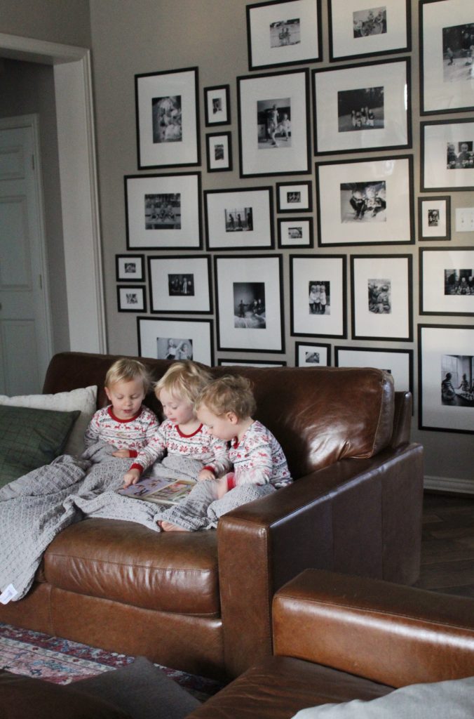
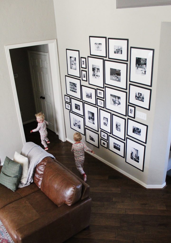
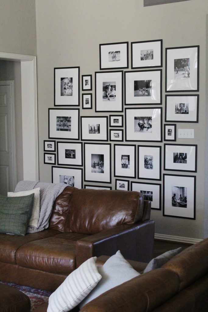
However, I quickly realized that filling a wall the size of mine (roughly 8 feet by 8 feet) with even Target frames was going to be more than $500. And while I liked the idea of the wall extending all the way to the floor, I didn’t want my toddlers breaking glass frames every day.
In the end, it was IKEA that saved the day. I went with their FISKBO frames in 3 sizes: 16×20, 12×18, and 5×7. They’re super affordable ($1.99-$5.99) and they’re made of plastic, which is great for toddlers, but they impressively don’t look like plastic, especially once you once get all the stickers peeled off.
I hung my frames first, because when I went to IKEA with all 3 kids, I just kindof grabbed sizes at random while promising all the lollipops and Swedish meatballs, and didn’t really know how well they would fill the wall or what my pattern was going to be.
It turned out I was just short two frames after my first go with my haphazard patterning, so that was great and I just ordered the last two online for in-store pickup.
I used one nail per picture and it’s not exact, but that’s okay, I kindof like the mismatched look (and using lots of white space with the photos helps that feel more okay and not quite as busy).
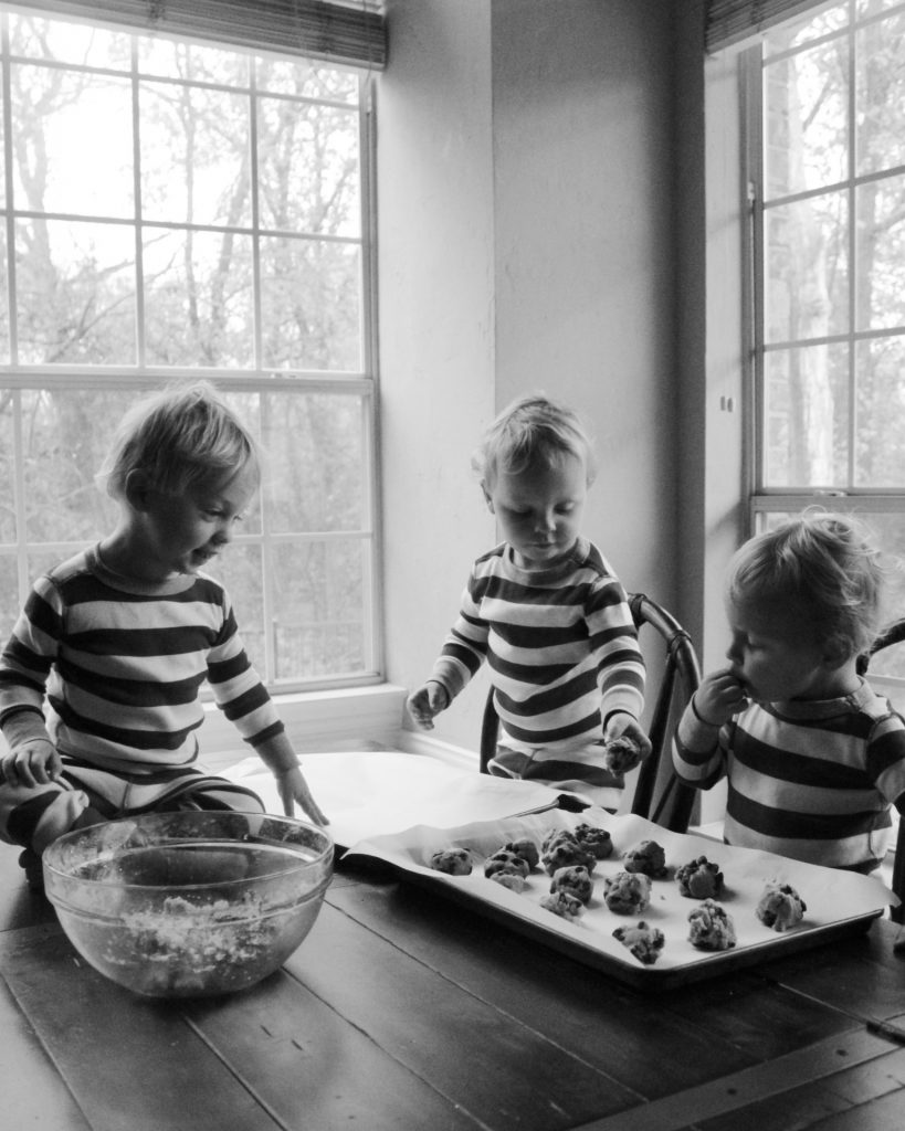
Over the past two years I have been trying to take better “everyday” photos of the kids — less “saying cheese,” more action shots of what life is actually life around here. Photos of scooter riding, jumping on beds, eating a super messy breakfast — things that would be fun to remember in future years.
Since the whole wall was going to be filled with photos, I thought these kinds of photos would add dimension and interest without just being an overwhelming wall of smiling children.
Eventually I may swap some of the photos for family members other than my kids (haha) because it is a lot of photos, but because this is what I have right now, this is what I started with.
I’m not a professional photographer by ANY means (don’t even qualify as an amateur) but I found a process that was pretty forgiving and worked well for this project:
- I used photos that were taken in natural light, no flash. Some were taken on my phone, but most on my Canon Rebel T6 (a very fun toy that takes great and very clear photos even though I have no idea how to use it). There is a “sport” mode on that camera that is great for capturing moving kids in natural light, which is most of what my life is, anyway.
- Using the (free) VSCO app on my phone, I increased exposure and contrast, and sometimes adjusted temperature and/or saturation to make the photo and skin tones feel warmer or cooler as needed.
- I converted to black and white using Pixlr (free) on my computer.
I then looked at my wall and realized I needed to count how many of each size I had hung horizontally vs. vertically, and accurately order enough to fill them all correctly. Math is not my strong suit, especially pregnant, so of course I messed that up and had to reorder a few. Good thing Costco photos are cheap, fast, and easy — that’s where I printed.
I also didn’t love any of the pre-made mats I found anywhere — they were all too thin, and didn’t give me the custom gallery look I wanted. So I decided to make my own with poster board. I ordered an oversized cutting mat and this poster board from Amazon to protect my dining table and was very happy with the quality of both.
Here are the sizes I decided on:
- 16×20 frames: 8×10 photos
- 12×18 frames: 5×7 photos
- 5×7 frames: wallet-sized photos
That gave me a nice thick mat around each photo. I used the cardboard back and/or the plastic cover of the photo frame as a template to cut the right size with a utility knife (word to the wise, “16×20” isn’t exactly 16×20, ask me how I know).
I also decided, one photo mat in, that I wasn’t actually going to cut out a square in the center for each photo and just taped the photo right on to the center of the mat. You seriously cannot tell. In fact, the lines are much straighter than anything I think I could have cut. And after that, I just had to put my new photos and mats back in their frames and get them back up on the wall.
The only thing that really stinks about these frames is that when you first open them, the cardboard on the back is held on very tightly with metal tabs that really hurt your fingers when you’re trying to pry them open. My husband was kind enough to do that with a utility knife one night after bedtime while I got the rest assembled.
I’d like to pretend that the above photo is how our living room always looks now, but as we all know, the below photo is more accurate.
But as we discussed, that’s why the plastic is so crucial.
We’ve been loving this wall and the character and coziness it brings to our living room. If you try this, comment below! I’d love to see yours and what improvements you make in the process!!
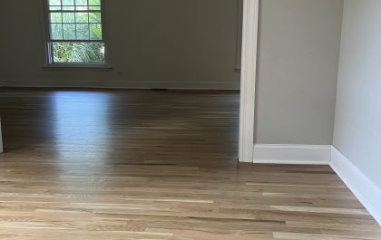
Flooring Renovation: Asbestos Removal and Choosing the Perfect Floor Stain
We finally completed the renovation of our first-floor flooring, and like most renovations, it was a bit more involved than we initially hoped for. When we bought the house three years ago, we knew the…
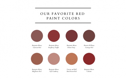
Roses are red: 8 beautiful shades of a paint color you might not realize you love
Lots of us love blues, greens, whites, and greys. And if neutrals are more your thing, you might think you need to stay far away from a color like red. But we think it’s worth…