

Lots of us love blues, greens, whites, and greys. And if neutrals are more your thing, you might think you need to stay far away from a color like red. But we think it’s worth another look.

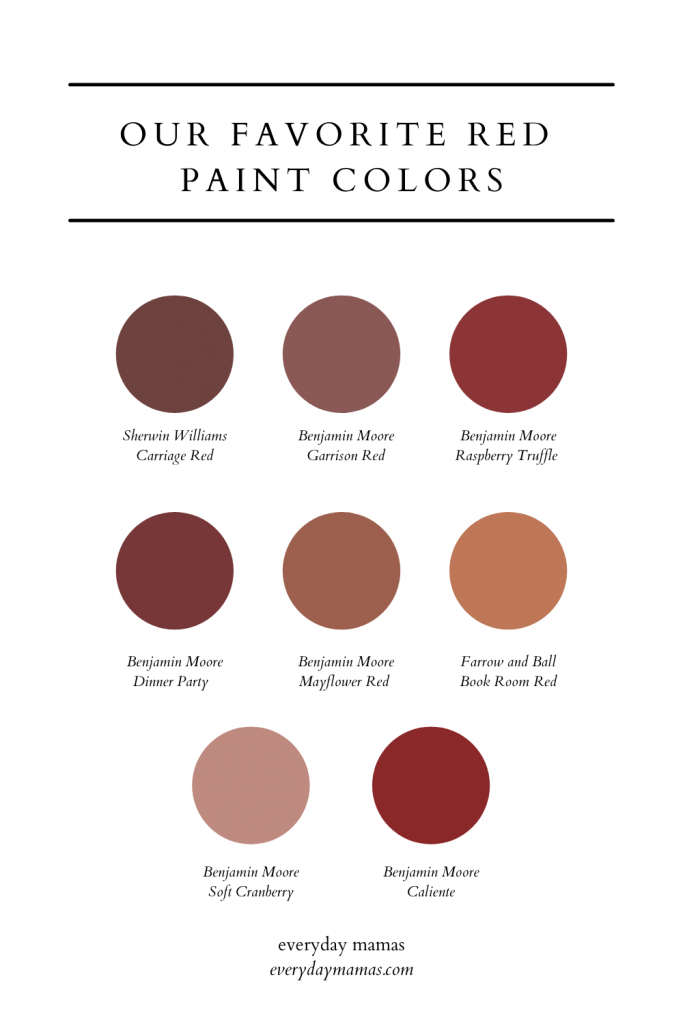
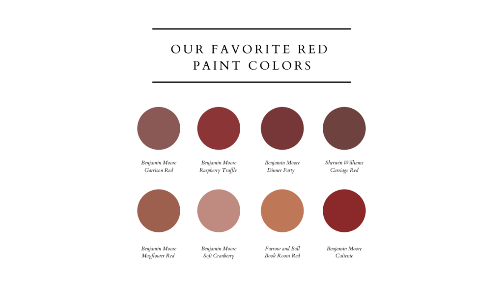
01. Mayflower Red (Benjamin Moore)

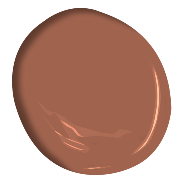
This beautiful color from the Historical Collection might be a bit rich for an ordinary room, but if you can provide contrast, its muted warmth will be stunning. It would be beautiful in as a wall color with white trim, or as a complement to wallpaper with coordinating tones especially in a smaller space. It pairs especially well with white, cream, sage, and warm wood tones.
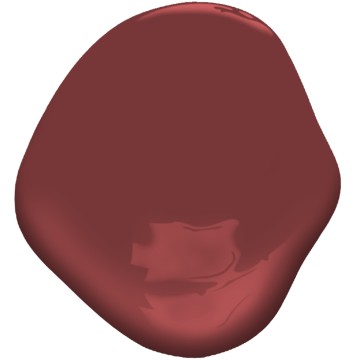
02. Book Room Red (Farrow and Ball)

Described as a “deep terracotta,” this shade is ideal for, well, a book room — pair with deep wood tones or natural ones, gilded frames, and mixed patterns for a truly warm and welcoming space that will add color and warmth without reading too red.
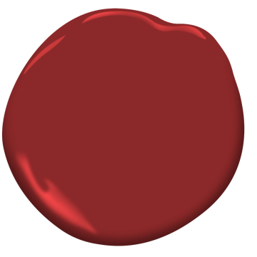
03. Dinner Party (Benjamin Moore)
This deeply saturated, almost burgundy red would be especially stunning as an exterior paint color. If you have a white house, try it on your shutters for an elegant but classic country look. It would also work nicely in a mudroom or laundry room where you have lots of white and wood tones and plenty of natural light.
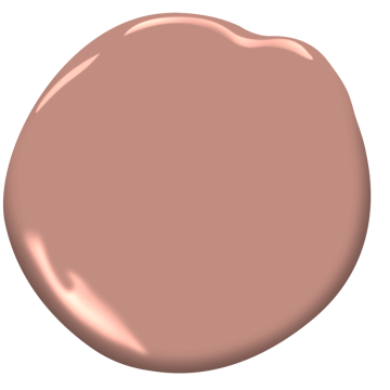
04. Raspberry Truffle (Benjamin Moore)

A traditional red that will always have a classic appeal, Raspberry Truffle might be just the red you’re looking for in a dining space, especially with traditional furniture shapes.
05. Garrison Red (Benjamin Moore)
The right red can set an interesting tone. Try Garrison Red HC-66, available at our Benjamin Moore retail location. pic.twitter.com/alxTGBoaos
— McGovern and Sons Benjamin Moore (@mcgovernandsons) November 2, 2018
Garrison Red is a nicely muted but deep red with grey undertones. It would be a beautiful backdrop for a vintage gallery wall, or works nicely with heavily textured or shapely pieces as pictured above.
06. Carriage Door (Sherwin Williams)

The picture shows everything, doesn’t it? This shade is timeless but fresh and pairs nicely with white, off-white, taupe and green. Try it as an exterior color, front door color, or even with a wallpaper like this for a colorful but classic space.
07. Soft Cranberry (Benjamin Moore)
Okay, maybe it’s not suuuper red and it leans a bit pink, but, we had to include this beautiful one because it’s just the right shade of muted light red/pink for a color block or accent in a baby girl nursery without being too much pink. Try Monticello Rose if you’d like to go a shade lighter.
08. Caliente (Benjamin Moore)
This is your show stopper red, the kind that’s bright and cheery on a front door especially with black and white and a large brass knocker. A red door like this can work with any style of home, but we love the classic look of this London-inspired entryway for inspiration.

![]()
